It’s been over 25 years since the World Wide Web became publicly available, between now and then it’s safe to say the internet’s undergone a series of significant changes and this is no more apparent than in website design. But interestingly, perhaps for the first time, people are beginning to look back rather than forward when considering the aesthetics of a web page.
We’re in an era where many users haven’t actually experienced the joys of Web 1.0 or early 2.0, therefore the notion of ‘online retro’ now holds weight in terms of design. With the presence of Web 3.0 looming, users are gravitating towards web pages with more nostalgic and outmoded properties because they stand out from the design norms of today.
We’re going to run through some of the best retro websites that are still active and, more importantly, show you how by adopting certain elements, your organisation can generate more leads.
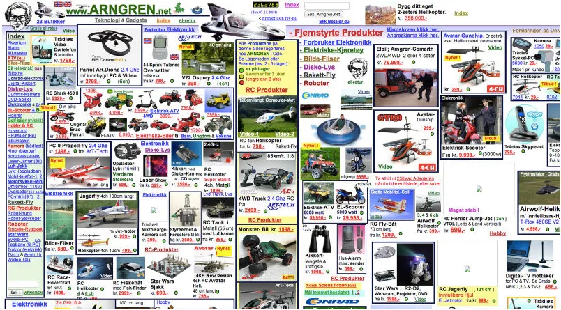
Arngren
A Norwegian gadget sales site with an extremely retro feel, best of all it’s still active. Although slightly overwhelming, it cuts straight to the point, displaying an array of products in a mishmash of images. This style can be effective in maximising product exposure, which suits companies selling physical products as opposed to services.
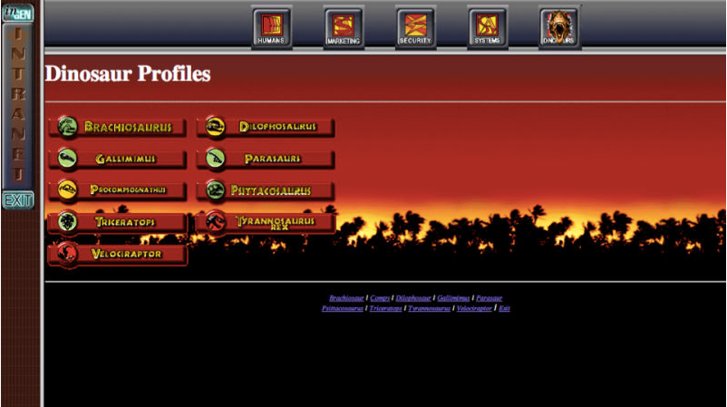
The Lost World
Jurassic Park: The Lost World is a complete viral marketing campaign by INGEN, the fictional company central to the movie. Rigid borders, faded colour effects and a user-friendly interface: the Lost World is true 90s. Note the ‘intranet’ graphic on the sidebar; it upholds the narrative that “you are a part of the fictional Jurassic universe” – an effective way to create a sense of inclusion and exclusivity, placing the user in the narrative which can translate into brand loyalty.

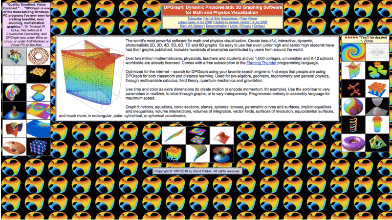
DPGraph
A personal favourite – this is “Dynamic Photorealistic 3D Graphing Software for Math and Physics Visualization”. The page is full of science and psychedelic animated gifs from 1997 – very retro indeed. Some of these spinning around your website are sure to boost user engagement!

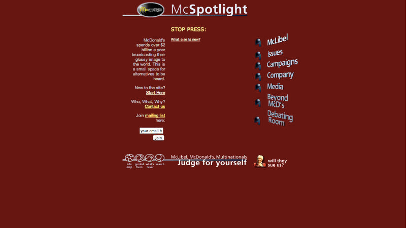
McSpotlight
“McLibels” with a McGenda – the biggest and most read Anti-McDonald’s website the WWW has ever seen. Minimalistic in design with 3D typography 1997 WordArt would be proud of, this retro web page has come full circle and looks a trendy picture in the 21st century.

So go retro: is it the future of web design?
Acne Studios
Straight outta 2018, Acne Studio’s website is a perfect example of a modern-day website adapting retro to stand out from the rest. The progressive fashion brand identified a gap in the market capitalising on the emerging trend of online retro. The 1.0-like scrolling function, colour theme and typography align with the fashion brand’s underlining aesthetic of bold simplicity and unique minimalism.
With creative fashion brands such as Acne Studios incorporating early web 1.0 and 2.0 aspects into the aesthetics of their website, you can expect to see more retro (cha cha) sliding its way into website design in 2018.
If you’d like to know more about website development, design or anything else marketing, get in touch!


